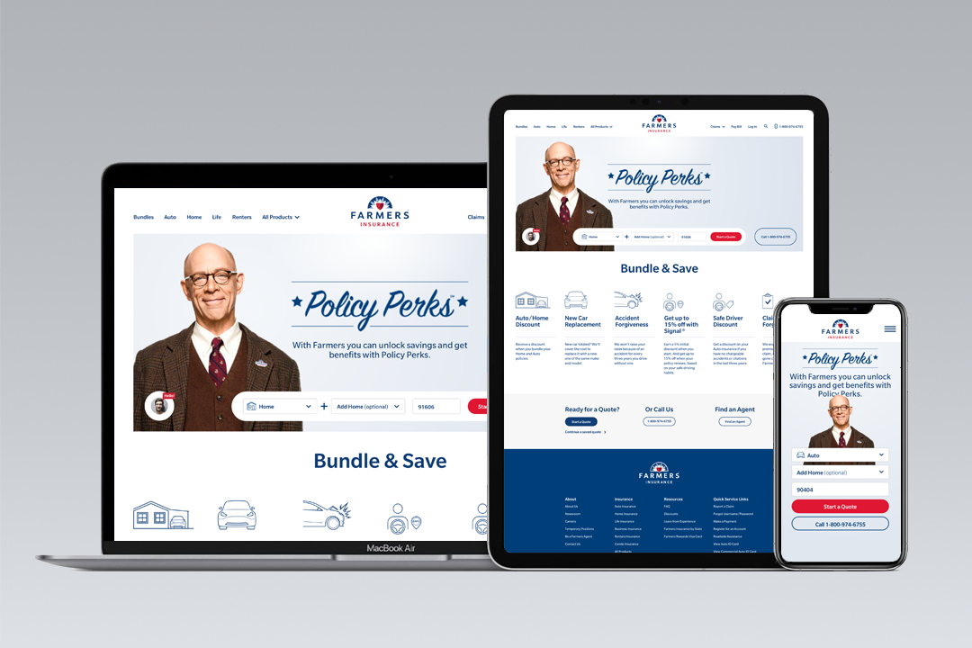
Overview
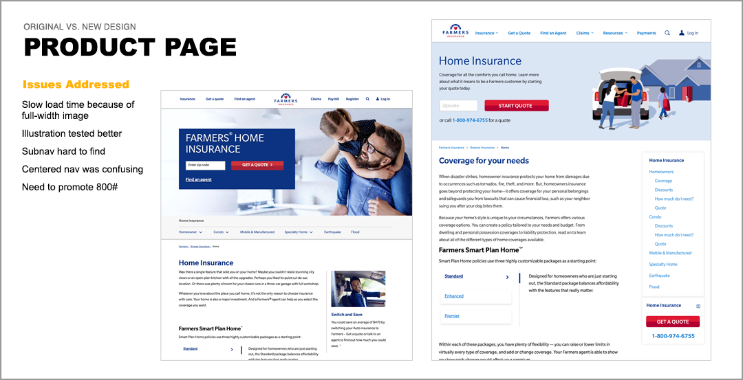
Our Farmers.com website had become too crowded and unfocused, resulting in low engagement and quote starts. The redesign consisted of a new mega menu navigation with updated information architecture, a more focused quoting tool, and introduction of illustrations on the product pages that decreased load times substantially.
Problem Statement
How might we increase quote starts and navigation engagement?
Methods and Approach
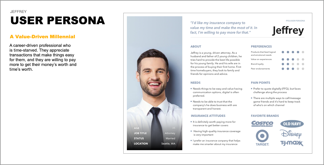
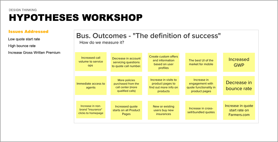
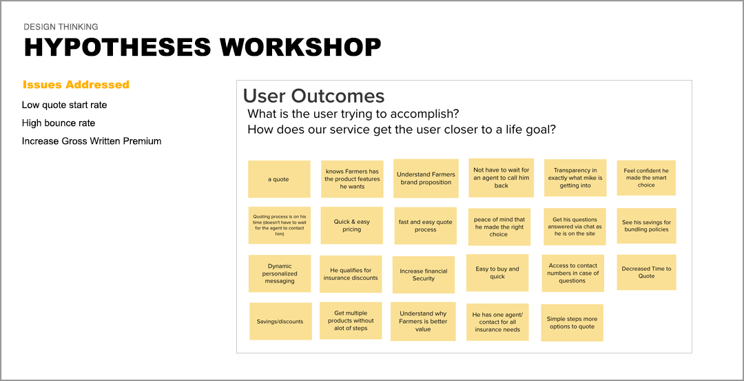
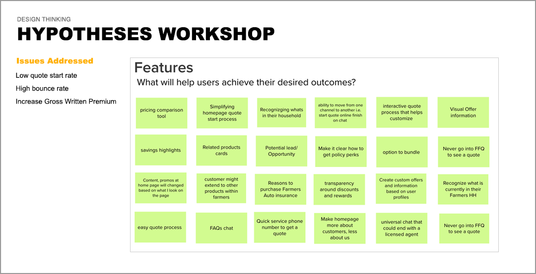
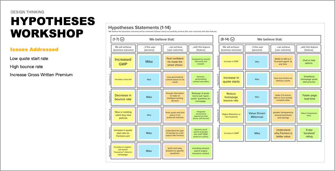
Conducted heuristic review, user interviews, created personas, task and user flows, sketching & wireframing, prototyping, usability testing, card sorting, and information architecture.
My Role
Overall UX Strategy, branding/art direction, personas, information architecture, some visual design.
Result
Increased navigation engagement rate by 31%, increase in quote starts by 10%.